How we built a photo festival app in just two days
On 5–6 October 2026, Fotoforma Festival brought photographers, creators and leading camera brands together at PGE Narodowy in Warsaw. With almost 70 speakers and lectures and workshops running simultaneously across several rooms, there was plenty to see. The harder part was figuring out what to see, when and where.
We're photographers ourselves, so we were looking forward to attending. But while exploring the program, we kept running into the same problem: how do you plan two days of overlapping sessions without constantly checking schedules, comparing times and trying to remember which talks caught your attention?
We decided to build something we'd actually want to use. Two days later, we had a working mobile-first web app with the complete festival program, ready to take with us to the event.
All the information was there. Using it was the problem
The organiser initially published the program as an image and downloadable PDF, later moving it directly onto the website. It contained everything we needed, but wasn’t particularly convenient for planning a day at a busy event.
At home, scrolling through a schedule is manageable. Standing between conference rooms with ten minutes before the next talk is a different story. You want to know what’s happening now, what overlaps and where you need to go next. Ideally, without zooming into a PDF or keeping several sessions in your head.
We also wanted to plan ahead, save interesting talks and quickly return to them during the festival. The existing program didn’t make that easy.
So rather than creating another way to browse the same information, we focused on turning the schedule into a practical planning tool.
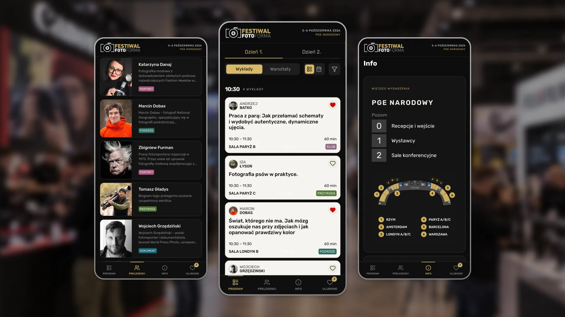
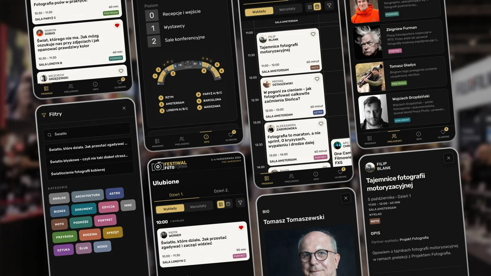
The program became the centre of the app, organised by day and session type. Each card shows the speaker, topic, time, duration and room, making the most important information easy to scan.
One of our key design decisions was to offer two complementary views. A chronological list helps you see what’s happening at a particular time, while a grid of rooms against a timeline makes overlapping sessions and free slots immediately visible. Both use the same data, but support different ways of planning.
We also introduced Favourites. A single tap saves a session to a personal schedule, organised just like the main program. Once you’ve chosen what interests you, there’s no need to browse the full agenda again.
We deliberately skipped registration and user accounts. For a two-day festival, saving a few talks shouldn’t require creating another profile.
Beyond the schedule, we added profiles of almost 70 speakers, with photos, biographies and topic tags, plus practical information about the venue. A map of PGE Narodowy’s three festival levels helps visitors find conference rooms, exhibitors and other key locations.
None of these features is complicated on its own. Together, they answer the questions that come up throughout the day, without making attendees search for information in different places.
From idea to working app in two days
With the festival approaching, we had a fixed deadline. That made prioritisation essential.
We started with the questions we wanted the app to answer, then defined its information architecture, main interactions and visual direction. The session card received particular attention because it’s used throughout the app. We also kept the interface close to the festival’s existing branding, so it would feel familiar to attendees.
We built the app using Replit, working with AI to implement the product we’d designed. The program data came from the organiser’s website, and Replit helped us keep it aligned with the published schedule.
The most complex component was the room-and-time grid. Instead of trying to describe every detail in prompts, we created a mockup in Figma to demonstrate the layout and components we wanted. Replit handled the implementation without us having to manually modify the code.
We kept the scope deliberately small and left out anything we couldn’t finish properly. The goal wasn’t to build an extensive event platform, but a reliable tool we could use ourselves.
After two days, we had a complete web app with the agenda, favourites, speaker profiles and venue information. No installation required, just a link that opens on any phone.
What happened when we used it
At Fotoforma Festival, the app did exactly what we’d built it for. Once we’d saved our sessions, we rarely needed the full program. We simply opened Favourites to see what was next, when it started and where to go.
We didn’t miss any of the talks we’d planned to attend, and spent less time figuring out the logistics. It was a small improvement, but one we appreciated throughout both days.
The project also reinforced something we believe about product design: speed comes from knowing what to build, not just from building faster. Replit handled the code, but defining the problem, deciding what mattered and shaping the experience were still our responsibilities.
There’s potential to take the idea further. Adding exhibitor profiles, stand locations and discount codes could make the app useful beyond the conference rooms, connecting visitors with the exhibition side of the festival as well.
For us, though, the most satisfying part was simple: we spotted a problem, built something to solve it and got to use it in the real world. All in two days.